
Overview

See more info about the team, tools, and timeline in the next slide.
Austin is the 3rd largest LGBTQIA+ city, but much of the community feels isolated and ignored because only mainstream LGBTQIA+ causes were supported.
We had two primary users with different needs: community organizers and business representatives. We tested 4 concepts and iterated on a design that combined the best of each. This final concept allowed both end users to post their needs so they could find each other. The client was so impressed with our work, he resolved to come back to Flatiron. One of our test participants even cried because she loved what she saw so much!
During the course of this project, I learned the importance of presenting design decisions over results, when to leave off features that are out of scope, and what it really means to be a team player beyond just collaboration.

Project Brief
This was a real-world project for a client as the final team phase of the Flatiron School UX Design course. Our client, Clayton, created QWELLAustin.org (as well as AustinOutpost.org and CityPride.org) to strengthen Austin’s LGBTQIA+ community. He wanted us to create a hub that connected affirming businesses with organizers to support initiatives for the community, heavily inspired by Unilever’s Take Action site.
Our scope was to deliver mid-fidelity designs for desktop and mobile that he would later get UI designers, and eventually developers, to implement.
The Problem
A community that feels unacknowledged and under-resourced
Despite Austin being the 3rd largest LGBTQIA+ city in America, many people felt isolated from the community. Clayton carried out a survey that showed how most LGBTQIA+ people felt like their needs were unmet or ignored professionally as well as personally. Through domain research and user interviews, we discovered:
-
30% of LGBTQIA+ individuals working at a nonprofit report that they experience depression as a result of an “unwelcoming work environment.” (Nonprofit Times, 2018)
-
Community organizers found it very difficult to get enough support for specialized, meaningful causes beyond parties for white gay men.
-
Business representatives did not know how to influence funding decisions, or even get supervisors to care about supporting causes that did not have an obvious impact or relevance to the company.
The Process
Making strategic design decisions to empower the community
We conducted four client workshops, facilitated three rounds of user interviews, and designed several iterations of wireframes and prototypes before we delivered the final solution. During each client meeting, we presented our findings and deliverables, then ran a workshop with our client to extract his ideas and critique.
During the kickoff meeting, I chose to utilize a proto-persona workshop to learn what the client knew about his target audience. He outlined two types of users:

Community Organizers
Create events and initiatives. They are LGBTQIA+ allies or people who want to directly champion a specific cause for their community.

Business Representatives
Support causes through their company. They work at mid-large companies and are allies or members of their company's LGBTQIA+ affinity group.
User research methodology
We chose the following research artifacts to inform our decisions throughout the design process. Each round used the same pool of interview participants:
-
Competitive analysis and domain research to learn more about the marketplace and find out where the community is under-served
-
Round 1 user interviews & subject matter expert interviews to gather qualitative insights about the problem. (I created the subject matter expert plan and supplied the questions for the user interview)
-
Round 2 comparative usability testing to contrast our divergent concepts. (I created much of the comparative usability test as well)
-
Round 3 semi-structured, task-based usability testing for key features in the converged design. (I was only able to produce a script for the final round, but it was much more in depth)
User Research Artifact - Design Principles
Based on our round one research findings, we created design principles that addressed our interview participants’ biggest worries around authenticity, inclusion, and recognition.
🔗 Connecting should be easy, not a chore 🔗
Take the hassle, time commitment, and expense out of networking. Make it simple and straightforward to find an ally and make an introduction.
💖 Meaningful 💖
Engage with organizations, events, and other initiatives with the purpose of making a measurable, positive impact in the LGBTQIA+ community.
🌈 A place for everyone 🌈
No one group should be the center of the LGBTQIA+ community. Give equal space, time, and resources for all groups, with special attention paid to frequently underrepresented groups.
💸 Sustainable 💸
Strive for stability and self sustainability through involvement that empowers the LGBTQIA+ community to own their resources.
🛠️ Resourceful 🛠️
Money is not the only, or most important, resource that should be highlighted. Make space for all types of resources that can be offered by different groups and organizations.
🎯 Relevance beyond mission statements 🎯
Help organizations see how their mission aligns with the needs of the LGBTQIA+ community and how getting involved will be mutually beneficial.
🤩 More than rainbow stickers 🤩
Offer recognition in genuine forms for businesses and community members who are meaningfully serving the LGBTQIA+ community.
User Research Artifact - Storyboarding
To further direct our design decisions and figure out which features to prioritize, I created a site map, storyboard, and a usability test prep document. From these artifacts, we discovered some important details that we didn't think about before.

The Discoveries
They wanted meaningful and authentic resources for their specific needs
During the process of creating a site map, I realized how important the Dashboard feature would be for this product. Initially, we thought about it as a typical account settings page. But mapping out how the site would work to this detail showed me a major value-add that we nearly missed:
💡
Both organizers and businesses alike needed a way to organize all of their activity, to manage the contacts they make and the initiatives they support.
Because right now, all people have is a digital pile of text messages, emails, spreadsheets, and google docs.

We were not able to do card sorts or other research to inform the information architecture, so I used our Round 1 and 2 interview insights to detail which features our users wanted. I quickly created this site map for internal use only.
A major insight we learned from user interviews was the need to easily show the 💖 meaningful impact an initiative would have for both businesses and organizers.
Another insight was the inclusion of more 🛠️ resourceful ways to contribute to a cause other than monetary donations (a highly regulated and onerous process).
The Solutions

A content first, dashboard centric portal to post affirming business and community initiatives
I thought I was giving them everything!
Our converged design took the best parts of each of our divergent concepts.
Participants loved having a homepage that allowed them to see everything that was available without having to search the site for it. I thought this meant creating a page where people instantly could see the full scope of the site: content, filters, features, navigation, and any other options.
But in reality...
⚠️
They liked the grid layout, but did not know what to do. They asked things like:
'Where should I go first? Who is this for? What do these options mean?'
The client, and most test participants, all thought my design was too busy, confusing, and cluttered. 😬
I had to go back to the drawing board and simplify the process
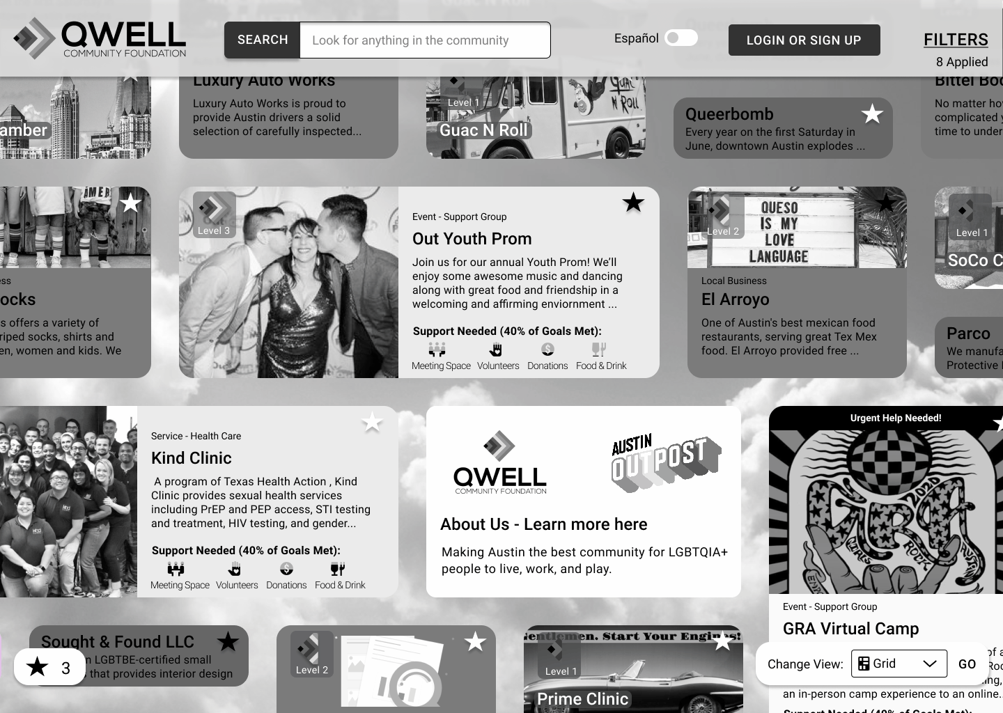
Using feedback from our usability testing, I implemented the following: onboarding to funnel people into the correct features, a homepage that focused on the content, and a filtering system that used a standard sidebar for advanced filters.
Lo-and-behold, I came right back around to almost copying Unilever’s design! In our version, I standardized the card sizes, tying each to activity level. This served the purpose of rewarding the more active and trusted community members with 🤩 recognition beyond just badges. This focus also allowed me to create a more detailed yet simple filter system.
There was an even split between those that wanted to see a list vs a map view, plus the client’s preference for a grid view, so we made it 🌈 a place for everyone and designed a homepage with multiple ways to explore the community.
The Outcomes
So delightful it drew tears of joy!
During our meetings, the client was excited to see the evolution of how our concepts solved his user’s problems. Clayton was so impressed with our deliverables that he repeatedly mentioned wanting to come back to Flatiron so that a team of UI designers could continue our work.
Best of all, one of the people we interviewed loved these concepts so much that she called Clayton and cried out of sheer delight about what we were designing!
Here are a few of the many kind words our interview participants and target audience said about the designs:

Naomi, Business Representative
I would love to see my affinity group have access to this (dashboard) so they can see all of it on their page

Adan, Community Leader
I love that this is the only one of its kind, like a home base for this work that feels like it’s pretty spread out throughout Austin

Sage, Community Organizer
The dashboard to me is what makes it different from just a searchable database. It makes it much more of a marketing tool. And that is what makes it valuable
You can find my future recommendations and wireframe annotations for the client handoff here
Lessons Learned
I learned a lot during this project. It was my first time working with a client as a designer. Though I was working remotely for years even before this pandemic, having to manage my mental health, energy levels, and time during this crisis was a new experience in and of itself. Here are my key takeaways:
-
Working with a client sometimes requires a focus on insights and decision-making above talking about process and presenting options. During our first two meetings, we simply wanted to present our findings and ask the client for what he wanted to do. But we realized that it was better to tell him what we thought should be done next. This made it easy for him to say yes or no and provide useful feedback.
-
Sometimes it’s better to leave a feature off if the process for that feature is far more complicated than the scope of the project. The donations feature mentioned above was not the only complicated function we wanted to include. We attempted to include educational resources, a community store, and even talked about an IoT device for a while as well.
-
Being a ‘team player’ is not just about collaborating, but also communicating. When times get hard and your team is struggling with deadlines, it is critical to reach out and see how everyone is doing. We did not communicate very well during Sprint 2 and our divergent concepts suffered for it. During Sprint 3, I made sure to check availability and was thus able to adjust timeline and deliverable expectations with the client proactively.
Explore More...

About Me
My Story
I want to massively change the world for the better with magical technology and ambitious empathy.

Dewey
A UX Design Project
We designed a website that helped job seekers utilize their local library to find and prepare for a new career.

iSimu VR
A Service Design Project
I lead the development of an operations manual to codify standards, improve service, and increase productivity.